Re-vamping the Goodreads app
A case study
Goodreads is an application to find new books, connect with other book junkies, leave and get reviews, follow your favorite authors, and participate in discussions.
The idea behind this app is as alluring to its 90 million users as it sounds. To explore my creativity, as a user and a designer, I decided to dig deeper into some problems that people face and try to find solutions for them.
Duration: 1 month(September 2020)
Tools: Figma, X-Mind, Blender
.png)
Re-discovering the original quintessence
The Confrontation
Compared to the web and the iOS version, the ratings for the android version of the application are significantly disappointing. This is because of the difference in the features provided on different versions of the app.
Therefore, my main focus is the android version of the app.
Blue sky research
To understand the pain points that users encounter and to collect data I started by reading and analyzing reviews on play store and google reviews.
Hidden features

Limited features

For more insight, I decided to conduct a survey by sending out a simple google form to the members of my book club and got 25 responses. Here is what they had to say:
_edited.jpg)
_edited.jpg)
_edited.jpg)
_edited.jpg)
Complains from the survey
_edited.jpg)
Flies in the ointment
1
Difficulty accessing features. A lot of features that should be readily available are hidden inside nested menus.
2
The user doesn’t have a choice to select what they what to see in their feed and what they wish to hide.
3
Incomplete application. Some details that could make the interaction easier are missing.
4
Some tweaks in the design could make positive changes.
After studying the responses and taking note of all the mentioned inconsistencies, it was time to zone in and set me some constraints to work within.
The Decision:
High-end goals
1

Re-designing the limitations of certain features.
2

Adding some new features to embrace the complete essence of the app.
3

Personalizing the user experience.
Thought showers

Moving to the drawing board
navigation bar

There is already a search bar on top of the screen and the search option in the menu takes you to the recommendations page. The same icon is being used for two different purposes.
Therefore, combining the search and discover options in the navigation menu to provide unique icons with their individual actions.
3
1
2
Homepage


The Homepage only displays updates from authors, friends, and communities.
Also, there is no separation between all these different sources.
Moved the current year challenge card on the homepage so there is no need to look for it in nested menus. As the reading challenge is one of the most liked features, the banner should be easily accessible.
The rest of the updates from authors and friends can be minimized if the user doesn’t wish to view them.

Added the currently reading progress bar right under the challenge card to be readily accessible to update the reading progress by the user.
1
Finding friends

The search bar doesn't let you search for new people that are not connected to you through the app.

Added a button to search for friends using their username.
On the shelves

1

Added a menu to every book card which takes the user to a pop up providing the option to change the shelves of the book.
There will be no need to load two full pages to be able to move the book to another shelf.
The pop-up also has the option to delete the book from all the shelves.
2
1
Explore


On top of the explore section, the user gets to choose if they want to search by the genre, author, language, country, or publisher.

Below that the user can browse new releases by month and year.
3
2
1
Recommendations


Re-positioned the recommendations from the “more” menu onto the explore page.
Moved the news/ interviews and featured lists from the explore page to recommendations.

In the recommendations, section books are recommended by the authors you have read, from your favorite genres.
1
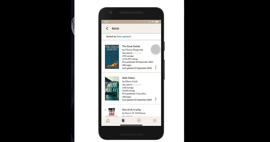
My Books


With the same features, re-designed the look of the page.
This bolder look compels the user to take action.
1
Reading Progress and changing editions

Added an extra button to allow the user to switch editions of the book as the number of pages will differ for different editions.

6
5
4
3
2
1
Book Details
Re-designed the rating system to be able to rate half stars.
Added a few book details like language and publisher of the book for which they would otherwise have to go to another site.
Added more books by the author.
Added the genre of the book. This is a crucial part that readers consider when choosing their next read.
Re-designed the rating and reviews section to allow the user to minimize the information they don’t want to see. This gives them a choice.

Added different editions of the same book to let the reader know what forms/ languages the book is available in. This eliminates the need for an extra google search.

1
Customize Homepage

Added an option to customize the homepage to personalize the user experience. This gives them the chance to have their own unique homepage where they aren't forced to see information that they don't wish to.
Looking back
Key takeaways
1. Thinking that some application is not working as I would like it to and then actually trying to come up with ways to make it effective is a task. And if you convince yourself to spend time researching it will make the process a lot easier and give you a clear perspective of where you want to go with the solutions.
This was a self-initiated project and I got about 25 responses to the survey I conducted. Next time I will make sure to try and expand my research to a larger extent.
2. Contrary to the first point it is never a good idea to try and solve every single detailed problem that you come across. It is important to set goals/ constraints and try to achieve them as effectively as possible.
3. Making style guides is key. Or better, making detailed style guides is the way to go. In this project, I did make components for icons and decided and recorded colors beforehand but didn't do the same for fonts. Font sizing and styling are equally important. Because I wasn't prepared with the guide I had to go back and forth changing things over and over in a state of confusion.
4. There is no need to design all icons by yourself. Because I was having fun I did it anyway and I don't regret it. But if you arent creating/ designing your own style of icons it's easier to just import them.
Background
When the lockdown started feeling like a punishment and not just an extensive holiday my brother suggested I try this course on UI/UX design. When I started the course, I was very excited to make designs but quickly learned that there is more to it than just aesthetics. And the idea of being visually creative during solving problems became addictive in a few weeks. After finishing the course I kept designing random stuff, sometimes trying to simply copy already existing illustrations for practice and then coming up with ideas for my own mobile apps.
This case study is nowhere near perfect but it has given me a chance to look at the whole concept of mobile design very differently. Instead of being frustrated with an app and then angrily uninstalling it, this new-found knowledge about UX design inspired me to try and solve some of those problems.
It wasn't easy navigating through the do's and don't(s) of writing, designing, researching, and reaching conclusions. This process for multiple reasons took me a few months to complete, in which I lost track many times but finally I was able to complete it. This project not only tested my creative skills but also challenged my previously lacking self-discipline caused by the pandemic.